I’ve lost count how many times a web developer has told me, “Our entire site has to be 20% faster because ____ (first name) over in _____ (department name) said so.” Even more common is the belief that that a “good” web performance goal is to be faster than your competition. But is faster actually a “good” outcome? Is it even possible that “good” web performance is something you can measure?
As someone who has spent the last 17 years building and providing web performance tools, I’m going to share five commonly held principles regarding web performance that developers should definitely rethink.
1. I need to speed up my entire site
I recently worked with a credit card issuer that planned to invest over $1 million and about six months of development work improving the speed of its entire site by 50%. The team decided to start optimizing the home page first because “that’s what the executives used to compare their site to leading competitors.” My company’s technology correlated the company's site speed to online sales for each page, and the data indicated virtually no correlation between the speed of the home page and the decision to buy.
Many sites we analyze have a significant correlation between home page speeds and conversion rates and cart sizes, but every site is different. In this case, no matter how fast the home page got, the company would not realize additional credit card signups. Instead, improving the speed of its application page by just 100ms would uncover $670,000 worth of new signups per week. The developers re-prioritized and quickly realized more revenue.
Revised principle: Don’t spend valuable resources speeding up pages that won’t improve revenue.
Instead, before beginning any performance project, identify which web pages have the highest traffic and find pages that play a key role in the customer journey. A good place to start is any page that has a call-to-action button (e.g., add to cart, sign up for newsletter). Those pages are often the easiest to optimize because they are image-heavy and have tons of content loading before the DOM Interactive. This is the moment users can begin to interact with the web page and where precious milliseconds are wasted when objects load unnecessarily before this milestone. Using a tag manager, you can easily move these objects further down in the load sequence, or better yet, after the browser load event if this does not sacrifice page functionality or aesthetics.
2. My site should load in two seconds or less
Let’s rewind back to that lesson you had on DNA in your high school biology class. Scientifically speaking, everyone is different. That’s why we don’t expect every child to grow at the same rate, run at the same speed, or play with the same toys. The same can be said about websites. Every web page has its own unique code design, images, content, and, more importantly, customer demographics, which dramatically affect how patient visitors are. So why should we expect all websites to load in two seconds or less? Faster doesn’t hurt. But will being faster than two seconds cause user satisfaction and site sales to go up?
Besides following a two-second benchmark, many developers regularly compare their site’s load time with their competition to determine what “good” page speed means. This approach may have been helpful 10 or 15 years ago, but with all the ways a site can enhance user experience at the expense of load time (e.g., rich images, interactive content), bench-marking against the competition to determine your site’s optimal speed is not the best way to make a compelling business case (think ROI) for speeding up your site. Every page has different speed targets it needs to achieve to maximize sales.
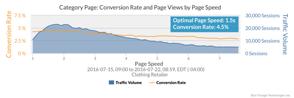
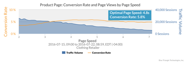
Revised principle: The best way to know these targets is to identify at what page speed the most users convert. This can be done by graphing page load time versus conversions.
Below are a couple of examples of this analysis. They are from the same clothing retailer’s website, but different pages. In each case, the optimal conversion rates are different. These are depicted by the peak of the yellow conversion rate line at different speeds on every page.


3. The faster my site, the higher my sales
One of the largest retailers in the United States decided to progressively compress images across all of its product pages. This is a great idea and can lead to some big payback if implemented carefully. In this case, it significantly shaved load time, but the image quality of the products declined significantly. Some images were a bit grainy. This resulted in lower sales and conversions for the fastest-loading pages. Sometimes, faster speeds do not mean higher sales if the aesthetics of a page are sacrificed.
The graph below shows how image compression impacted the page’s conversion rate and speed before and after implementation. Notice that while the page’s traffic experienced faster speeds (green-shaded area is further to the left) when images were compressed, the conversion rate was lower (purple line).

Clearly, shoppers on this site prefer a visually rich experience over a fast one. This opens the door to a new way of thinking about this problem. There is a balancing act between customer experience and site efficiency to maximize sales. If your site is too slow on key pages, you leave revenue on the table. At the same time, if you shrink all images to the point that the products are not appealing, then sales can be affected again.
Revised principle: Faster isn’t always better. Don’t blindly optimize your site in ways that will impact aesthetics or usability without first doing an A/B test on a small portion (10% to 20%) of your traffic.
And don’t stop there. Look at how the conversion rate over page speed curve changes. You just might get the biggest business impact by letting the marketing team put those big sexy images on the page with minimal optimizations.
4. Making one improvement can speed up my site all the way
One of our customers at a large hotel chain recently used the “death by a thousand cuts” phrase to describe why its website was slower than optimal speeds. The site was not unique in this area. Websites engaging in improvement projects usually net a quarter to a half of a second faster page speeds.
When we look at the aggregate activity by object or domain of the same page types across thousands of visitors, we find that many things are responsible for making pages slower than the optimal conversion speeds.
Revised principle: One single improvement is not likely to speed up your site to where it needs to be.
Here are a just a few of the “thousand cuts” that, together, are slowing your web pages. Each of these can be addressed to improve site performance.
- Slow base page time: Web pages are not optimized to get the most benefit of caching.
- Poorly implemented third-party content: Third-party content (stock image optimizers, vendor plug-ins, sales tracker tags, etc.) often load too early in the page without any functional or aesthetic benefit.
- Poorly implemented CDN strategies: The entire site gets included in the CDN when it’s first implemented, but when new items get introduced, they are not properly included in the CDN.
- Ergonomics of text-based files: Use minifiers to strip out white space and comments to reduce file size as you roll to production.
5. All third-party content hurts my site’s performance
Some larger sites have over 100 pieces of third-party content on every page, and these need to be managed appropriately so that speed and security aren’t compromised. When someone in marketing asks a web developer to put a tag on the site, the reaction is not usually positive, for obvious reasons. Tag management and governance have recently become a hot topic among web developers because of its potential impact on performance.
Revised principle: Not all third-party content hurts page performance. The more content you can move after the DOM Interactive, the less impact on user-perceived page speed.
Take a look at the table below, which shows page load time milestones. If I were to ask you how fast your site is, you would probably refer to the On Load Time since this is the moment at which everything on a web page is loaded. When managing third party content, it is more important to consider user perceived page speed at the moment of DOM Interactive. This is the moment your users can interact with your web page.

The more content that is loaded after this milestone, the less impact on perceived page speed. If you’re using a tag manager, this task should only take a few minutes. You’ll realize precious milliseconds that could make the difference between whether or not someone makes a purchase.
For example: Does Live Chat need to load before the DOM Interactive? (Answer: probably not.)
Key takeaways
- Don’t try to speed up your entire site. Focus instead on the web pages that have the highest traffic and also play a key role in the customer journey. These usually have the strongest correlation between speed and revenue.
- Your site doesn’t have to load in two seconds or less. Identify the specific page speed that yields the most conversions to determine how fast each web page needs to be.
- A faster site doesn’t always mean higher sales. Faster speeds often impact the aesthetics of your site, resulting in lower sales. Don’t blindly optimize your site without first doing an A/B test on a small portion (10% to 20%) of your traffic.
- Poor page speed is often like “death by a thousand cuts.” In a perfect world, speeding up your site to where it needs to be would take one simple change. But this is not a perfect world. There are a thousand (at least figuratively speaking) little things that are holding you back. Fix them, one at a time.
- Not all third-party content hurts page performance. The more content you can move after the DOM Interactive, the less impact there will be on user perceived page speed.

During the holiday rush, every shopper matters
Optimize the customer journey before the eCommerce event of the year.

.jpg)

